
TINO SEHGAL, ALAIN ROBBE-GRILLET RELAZIONE
2016
1000 x 700 mm offset printing in black and white
folding in a signature of 32 pages
project selected by AWDA - AIAP WOMEN in DESIGN AWARDS, September 30th, 2017: https://www.aiap-awda.com/
This project, as one part of the degree thesis "Textual galaxies. Typography, Visual Arts and Narrative Processes", concentrates a design method and approach to build connections between different communication disciplines.
In my text comparing the work of the artist/performer Tino Sehgal and the writer/philosopher/director Alain Robbe-Grillet’s novel “Jealousy”, the concept of “relationship” binds both of their philosophies.
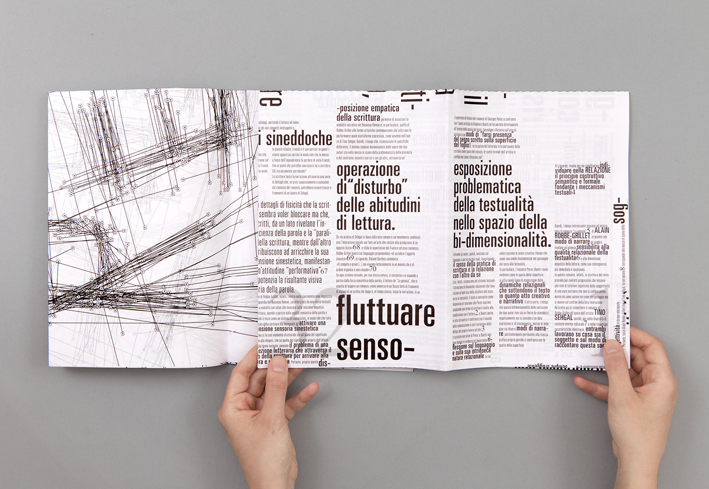
TEXT FORMATTING AND LAYOUT
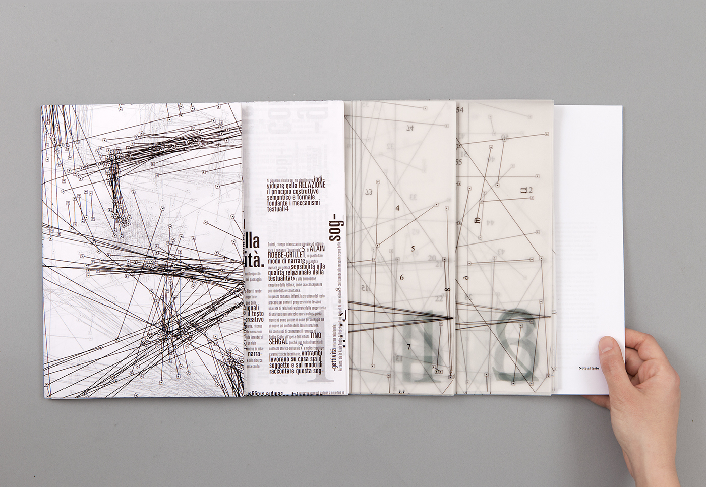
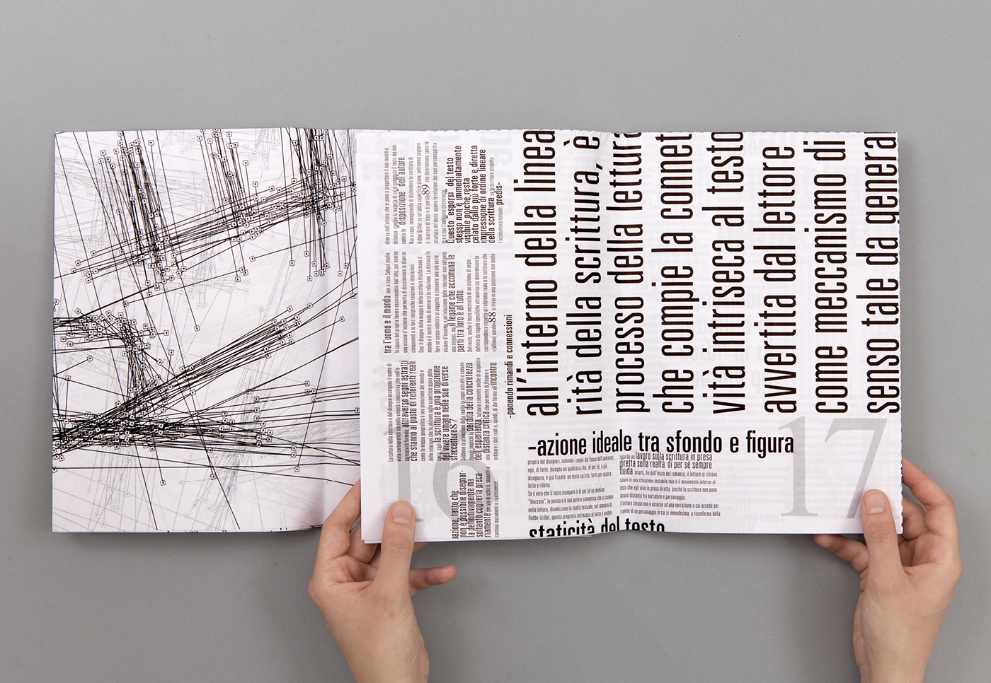
Firstly, I have created the layout of this text according to the 1/32 typographical imposition on the sheet of paper, without cutting the pages, but just folding them into the final format.
About the fonts_ I used Times New Roman for the page numbers and the footnotes because it is a serif font that refers to the writing and it is related to social communication.
However, for the body text, I used the font Univers (light condensed and ultra condensed series) because it has a density between the letters that forces the readability of the text itself and suggests the “non-textual quality” of Sehgal’s performances.
Hyphenation_ It's regarded as a part of the concept of “relationship”, fragments the contents semantically. Therefore, the text loses its immediate readability, causing the “typographic beholder” to behave differently from the traditional reading: in fact, the reader has to open the folded book and also move on the page in order to read the text.


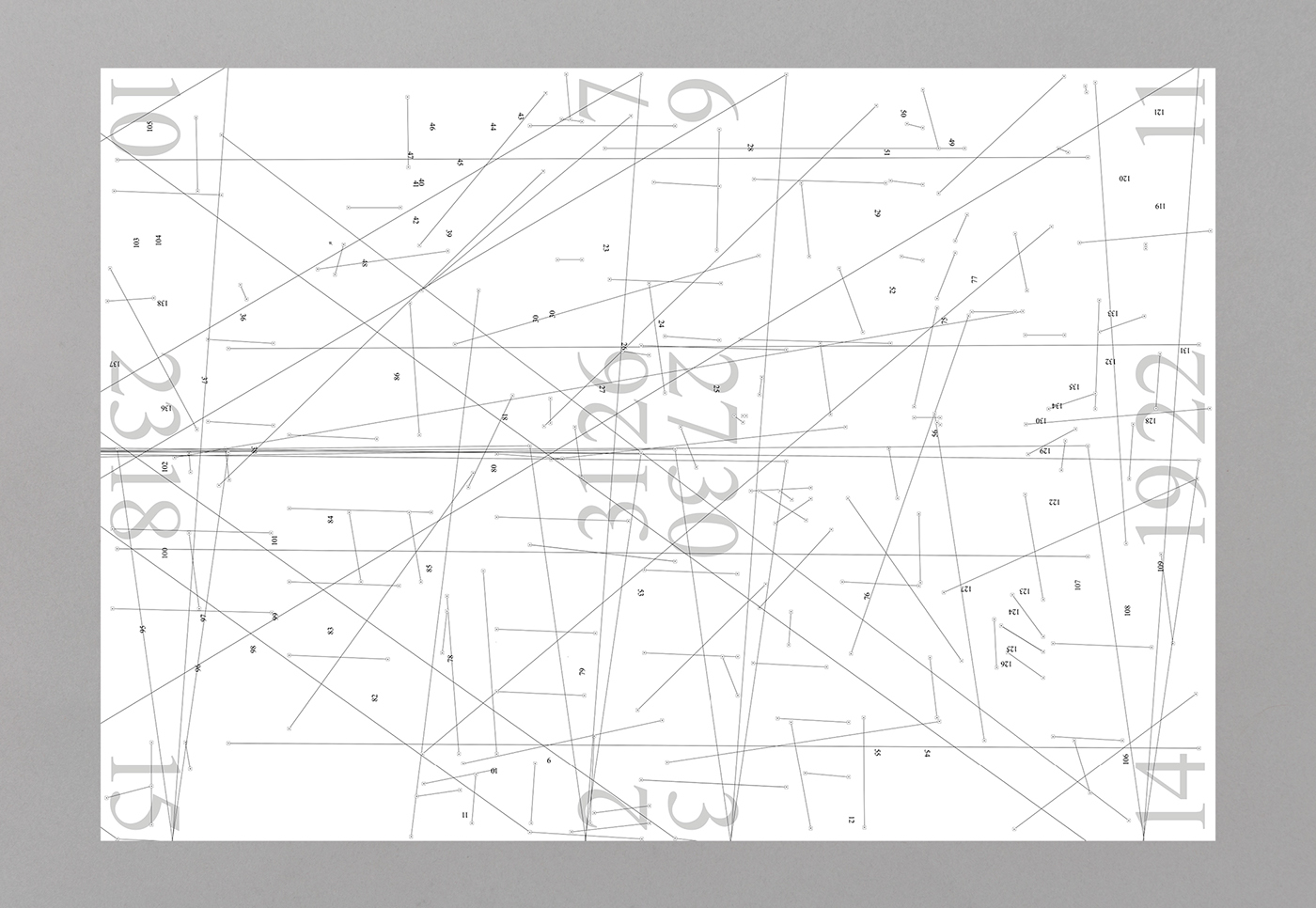
Page numbers and footnotes_ I also printed the text threads, the page numbers and the footnotes' numbers to keep a direct reference to the layout of the text.
If the text threads visualize the text’s invisible structure, the page numbers identify the book’s sequential logic, while the footnotes' numbers indicate “thresholds“ to another level of content, outside the main speech. Moreover, the text’s footnotes are laid out separately, because they are a type of textual content far distant both from Sehgal’s performative poetry and Robbe-Grillet’s linguistic experimentation.
All these elements highlight the multi-dimensional, semantic and visual qualities of reading and the continuous crossing between reading and writing through the spectatorship.

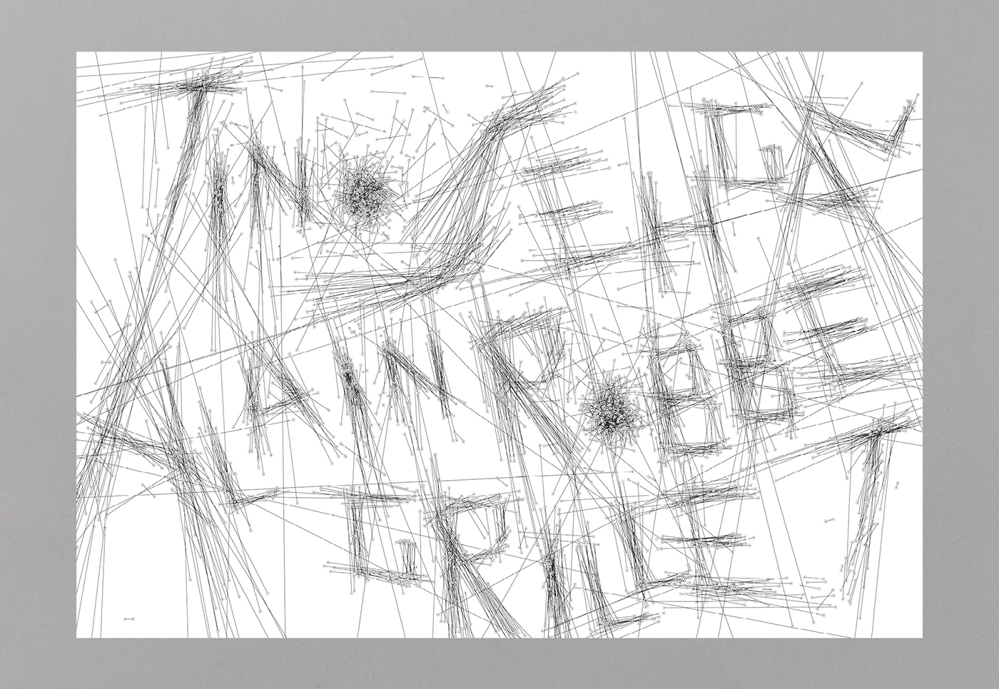
LETTERING
Secondly, following the position of the text frames in the layout I traced its “text threads”, that is the Adobe Indesign’s non-printable elements, to generate a lettering (TINO SEHGAL, ALAIN ROBBE-GRILLET, RELAZIONE).
In particular, I chose not to resize the text threads, just to preserve the concept of “relationship” and “interrelated identities”.
Also, I used groups of at least two text threads to create each letter so that their reciprocal relationships influence the letters’ design. Additionally, designing them, I paid particular attention to the qualities of “density” and “interference” that characterize both authors’ philosophies.
Therefore, the text threads as non-printable elements become a way of writing the text's invisible links, moving from the macrocosm of the page to the microcosm of the typeface, intended in an abstract sense, from “environment” to “individual”.


This project, here conveyed in both literary and visual forms, is open to new explorations.
I aspire to make mediological diversities means of cultural sharing, which problematizes the narration of experiences and the possible trans-codifications of languages and sensibilities.

